Ranking Every MLB Team’s Jersey Sponsor Patch
All jersey sponsorships suck. This holds true across baseball, across America, across all of sports. And yes, even soccer kit sponsorships are terrible. Just take a moment, look at the clean, classic kits from the ’70s, and honestly tell me that splashing “FLY EMIRATES” or “SNAPDRAGON” across the chest is an improvement. But, let’s be real—some jersey sponsorships suck slightly less than others. With that begrudging acknowledgement, here’s a definitive ranking of every MLB team’s jersey sponsor patch, from tolerably subtle to truly awful.
Tier Zero: Unsullied
T-1. Chicago White Sox
T-1. Colorado Rockies
T-1. Minnesota Twins
T-1. Tampa Bay Rays
T-1. Washington Nationals
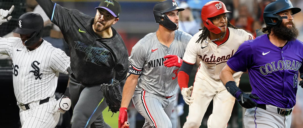
Look, I’m not naïve. I understand that these teams mostly don’t have sponsors because their value is so low that it’s not worth it for a company to pay to sponsor their jerseys yet. The White Sox and Rockies are in a historically bad stretch, the Nationals are in between contention windows, the Rays have regularly been in the bottom of attendance numbers since their inaugural season, and the Twins are often an afterthought (though my money is on them getting a jersey sponsor sometime this year.) Nevertheless, they are as-yet unsullied by sponsorship and thus make it to the top of the rankings.
Tier One: Hardly There
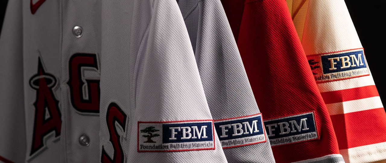
6. St. Louis Cardinals
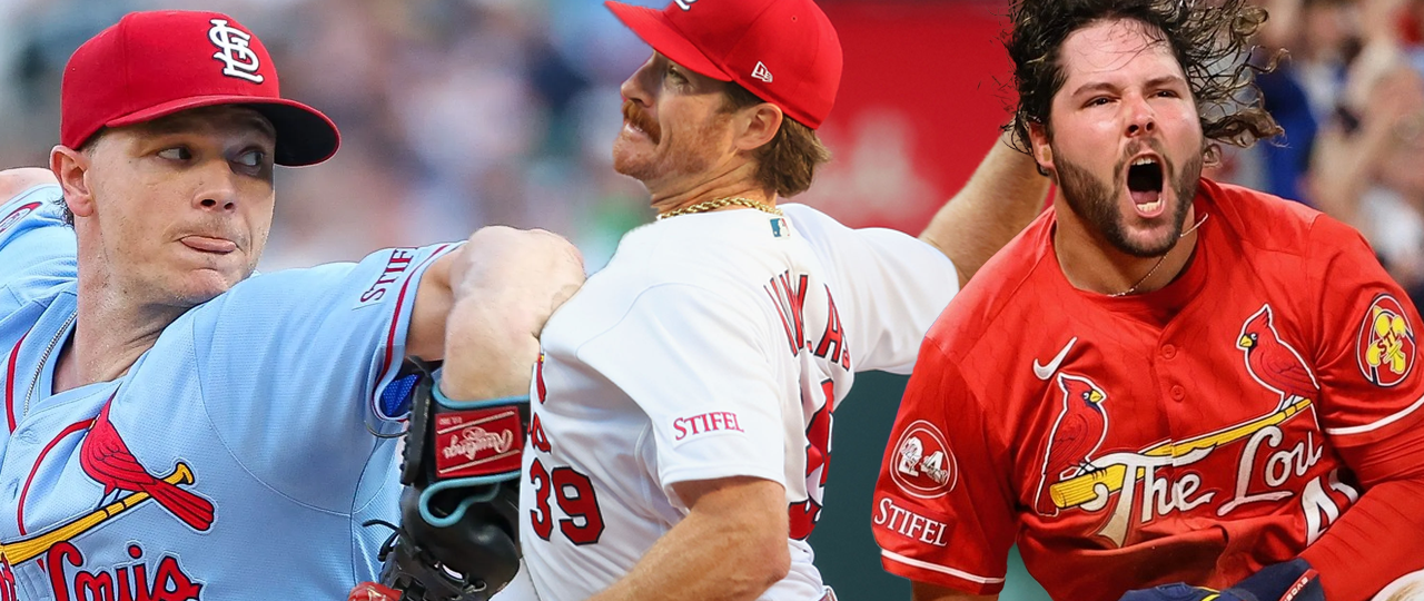
Yes, I’m aware I’m biased as a lifelong Cardinals fan, but the Stifel sponsorship on the Cardinals’ jerseys is the best of a bad situation. The base of the patch itself is color-matched to the jersey and the font is the same color as the stitching, piping, and Nike logo. If you didn’t know Stifel was a jersey sponsor, you might think it was a manufacturer or a recently passed coach or executive being honored with a sleeve patch. The Cardinals’ jersey set is regularly ranked among the best in sports and team president Bill DeWitt III takes such pride in the history associated with them that I have to assume he turned down offers from other companies in favor of the subtler approach Stifel offered.
Tier Two: The Color Matchers
7. Detroit Tigers
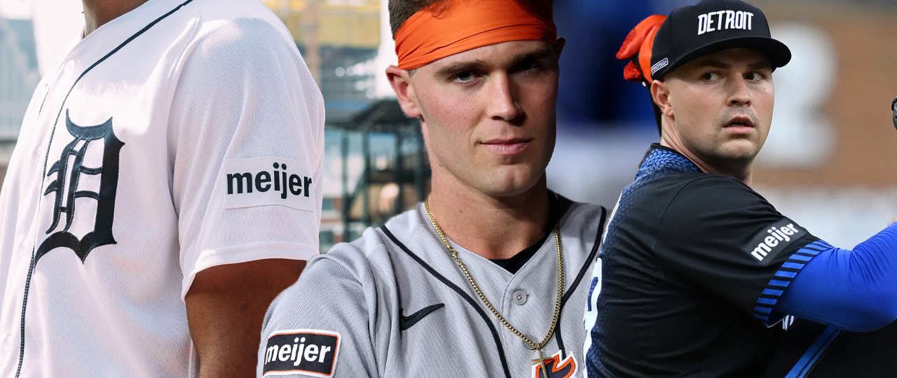
Much like the Cardinals, the Tigers jersey is well-regarded in sports, due in part to the fact that they’ve had limited changes throughout their history and, until the introduction of the City Connects last year, were just one of two teams without an alternate uniform, wearing only home whites and road greys. The Meijer sponsor patch would almost belong in Tier One with the Cardinals except for that pesky navy patch on the road greys which stands out quite a bit, in contrast to the color-matched patches on the home whites and City Connects. Still, as far as sponsor patches go, you could do far worse than this implementation.
8. New York Mets
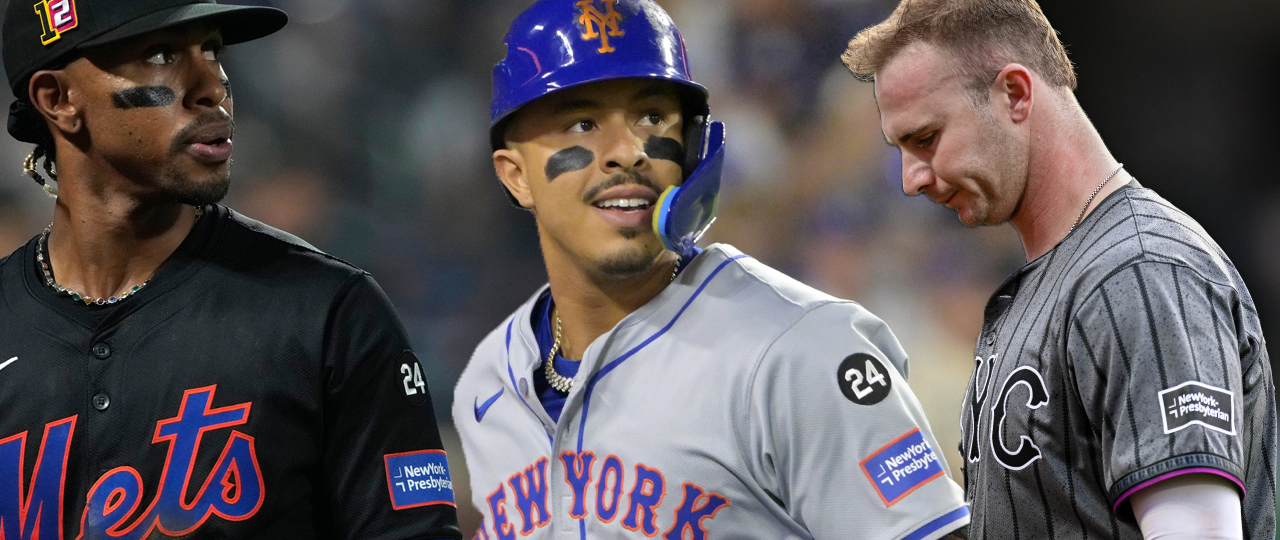
The Mets’ jersey sponsor is New York-Presbyterian Hospital, which gets a couple of extra points for having the city name on the jersey patch. NYP also color matched their logo to match the Mets’ colors, ditching their usual red for a blue patch with orange stitching to match the lettering on the front and back of the jersey and a black and white patch to match the lettering on the City Connect. I appreciate when a company is able to set aside their own branding to match the brand they’ve partnered with.
9. San Francisco Giants
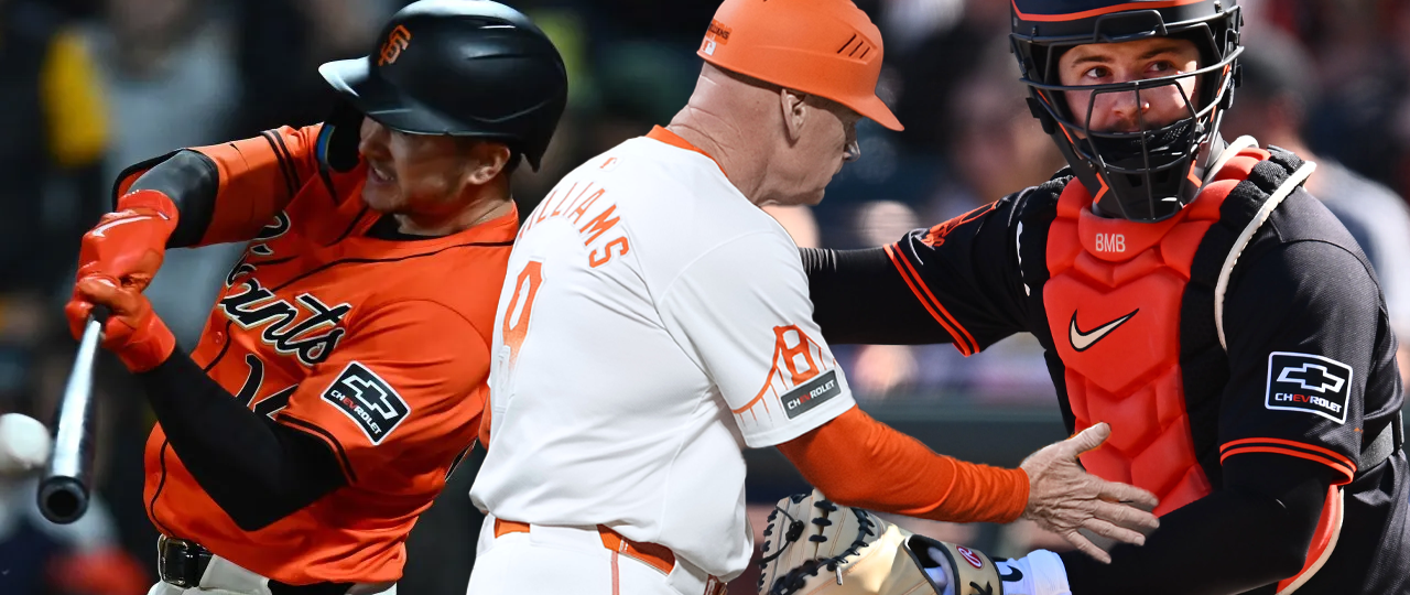
I initially had the Giants much lower but I bumped them up for two reasons: Firstly, the Chevrolet EV logo that’s used on these unis traditionally renders the EV in blue, which they swapped for orange to match the Giants’ colors, and secondly, they had the sense of taste to shrink the patch down for use on the City Connects so as to not break up the aesthetic of that uniform. While I do wish the regular patch was the size of the CC patch, and the CC patch is the only hit of black on an otherwise completely white and orange uniform, it’s still a solid application of an iconic brand.
Tier Three: The Wannabes
10. Los Angeles Angels
The Angels are another team that used to be much lower because of the weird placement of the patch above the piping on the City Connect jersey. Despite the fact that they beautifully color-matched the cream of the jersey, I was really bothered by the fact that the patch was nearly on the shoulder. But then I looked up to see how they apply the sleeve patch for left-handed batters and it turns out, they don’t! Unlike every other jersey patch which moves between the right and left sleeve depending on the batter’s handedness, the Angels City Connect leaves the patch on the right sleeve even for lefty batters, which I think totally rules and gets a bunch of extra points in my book.
11. Philadelphia Phillies
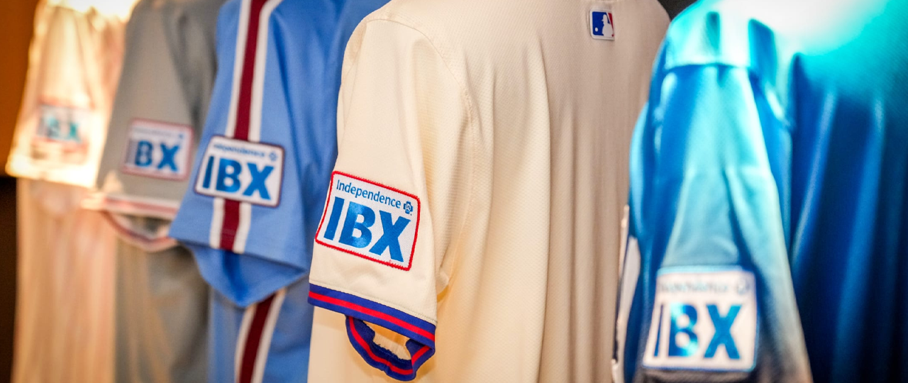
The Phillies got so close to color matching and then didn’t get over the goal line. Every one of these IBX (Independence Blue Cross) patches is rendered in the Blue Cross blue, with a white background and a border that matches a color of the jersey it’s on: red for the home white, road grey, and cream alt; maroon for the baby blue alt; and blue for the City Connect. The issue is that the Blue Cross blue doesn’t quite match the Phillies blue, and the white looks off on the grey and cream jerseys. Also these patches are way too big.
12. Cleveland Guardians
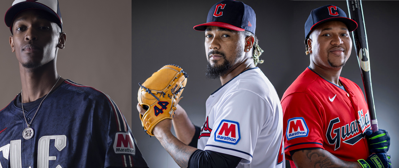
Why, oh why are the colors on this patch so bright? Aside from the fact that these patches are also quite large, Marathon’s colors are almost the same as the Guardians’, but instead of matching the Guardians’ colors and feeling like they belong on the jersey, they leave their own brighter colors and feel completely out of place. What’s especially baffling is that they did do this on the City Connect, so why not on the regular unis? Why do the Guardians hate me?
Tier Four: Great Fit, Meh Application
13. Los Angeles Dodgers
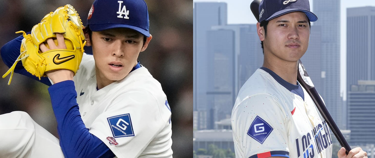
This is why I didn’t set a bunch of criteria that I had to follow, because by nearly every objective measure, the Dodgers sleeve patch is pretty good: the color matches perfectly, the sponsor has deep ties to the team (it literally owns them), and it could even pass for a non-sponsor patch though that’s more of a stretch. The only objective ding on it is that it’s too big and loud. It falls down here mostly because I think it’s fucked up that an investment banking company is sponsoring a jersey patch (and don’t get me started on the fact that they own the damn team and are probably bad for baseball.) This is my ranking, get fucked.
14. Pittsburgh Pirates
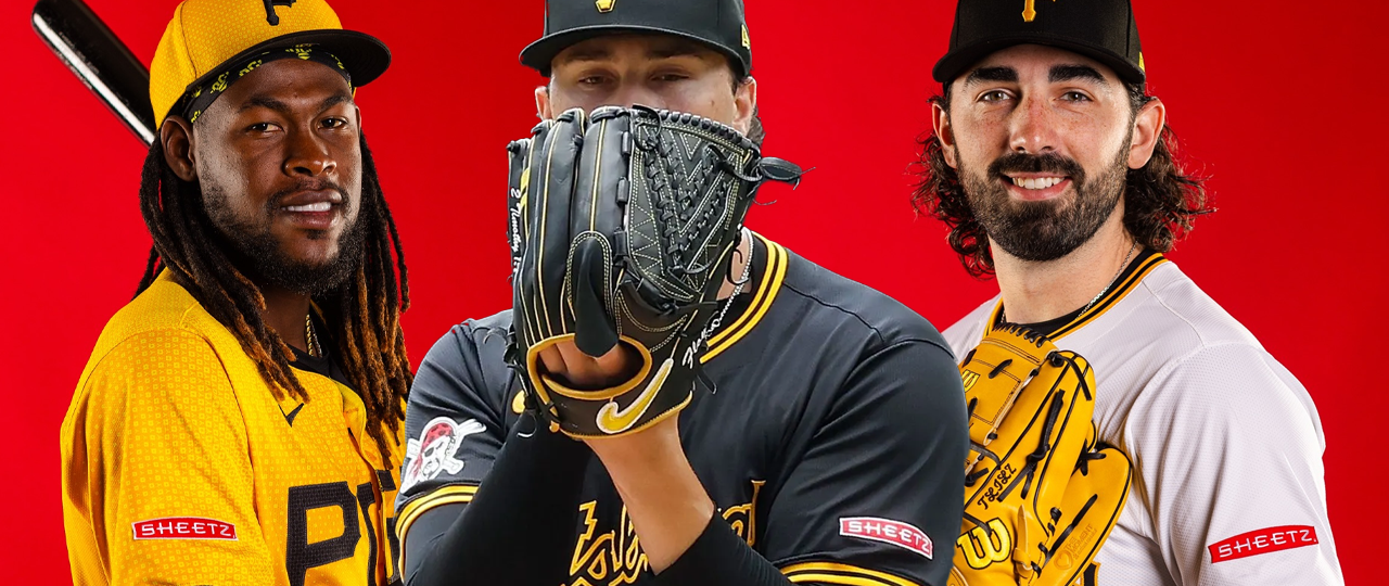
Sheetz is such an iconic brand in Pittsburgh and this patch is so understated that I do think it’s pretty great. The thing it gets dinged for primarily is that it’s bright red, which is a color the Pirates have used in the past but aren’t really using right now—except that the other sleeve patch the Pirates use is primarily white and red, so it kind of gets a pass. I just couldn’t justify putting it in Tier Two or Tier Three.
15. Cincinnati Reds
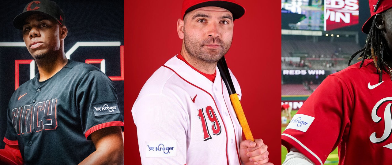
Dear Mr. Kroger,
Please stop being a pussy and allow your logo to be rendered in red and white. I promise nobody will get confused by it. It would move you right behind the Tigers.
Love,
Naaim
Tier Five: Motorola
16. Chicago Cubs
17. San Diego Padres
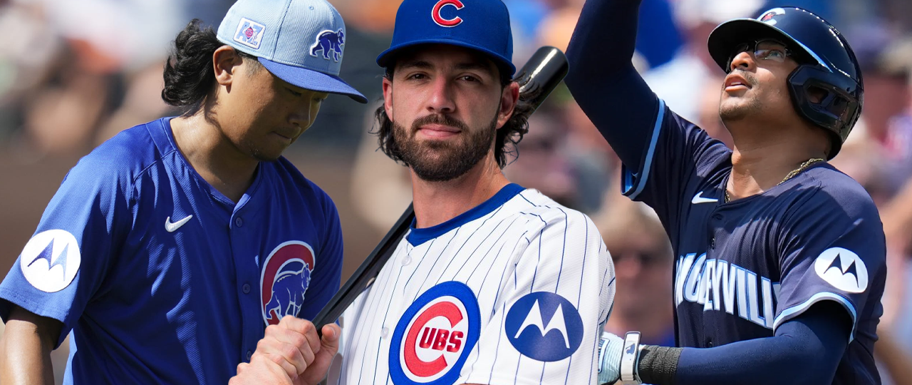
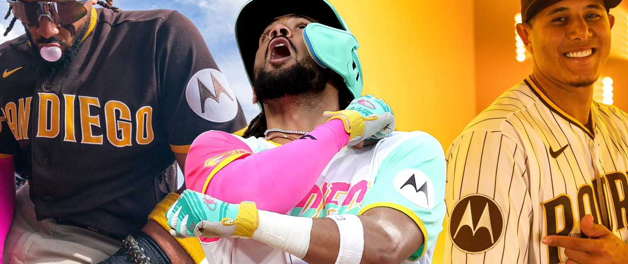
Motorola is no stranger to jersey sponsorships. At various times, they have sponsored the jersey of four separate NBA teams, including three in the same season (2022-23). I couldn’t really separate these from one another, so I just put them in a tier together. I might have even moved them up a tier if the patch wasn’t so damn big. The Cubs get the slight edge above the Padres because A. Motorola was founded and is still headquartered in Chicago, B. I like the application in blue more than in brown, and C. the Padres City Connect patch is just black and white which feels like a missed opportunity to go a little crazy with the logomark and let it be some mix of yellow, pink, and mint like the rest of the jersey.
Tier Six: The Standouts (Derogatory)
18. New York Yankees
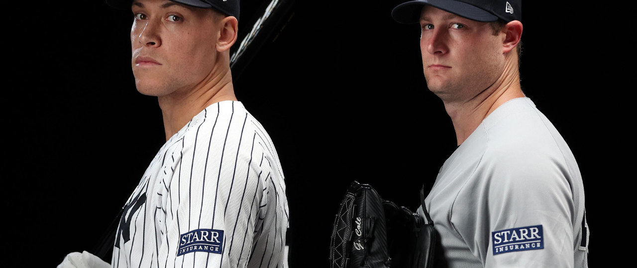
This is another team where, by most metrics, it’s pretty good. The colors match, the size is good, the company is headquartered in New York, and if not for the word “insurance,” could almost pass for a memorial patch. The problem is that any sleeve patch is going to stand out on a Yankees uniform. It’s sacrilege. George Steinbrenner would be rolling over in his grave if he could see this.
19. Milwaukee Brewers
20. Boston Red Sox
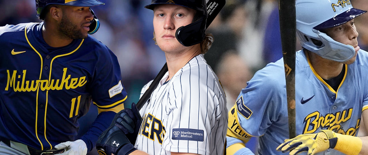
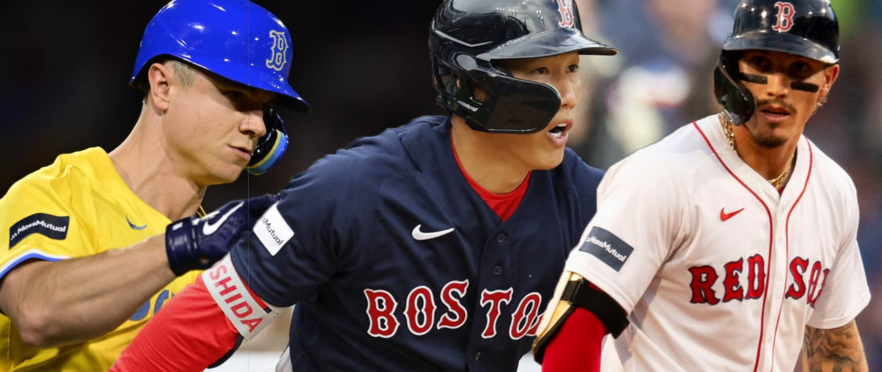
The thing about every patch in this tier is that they’re all a good size and color match just fine. My issue with them is that they stand out in a way that I’m sure the company is a big fan of and I hate. Northwestern Mutual puts yellow piping to highlight the presence of the patch on the Brewers’ jerseys and MassMutual makes sure the patch is dark on light jerseys and light on dark jerseys so your eye is drawn directly to it. That totally sucks. If they just inverted most of these colors, these (especially the Sox) would probably move into Tier One, but alas, they must be seen at any cost.
Tier ???: I Respect the Audacity
21. The Athletics
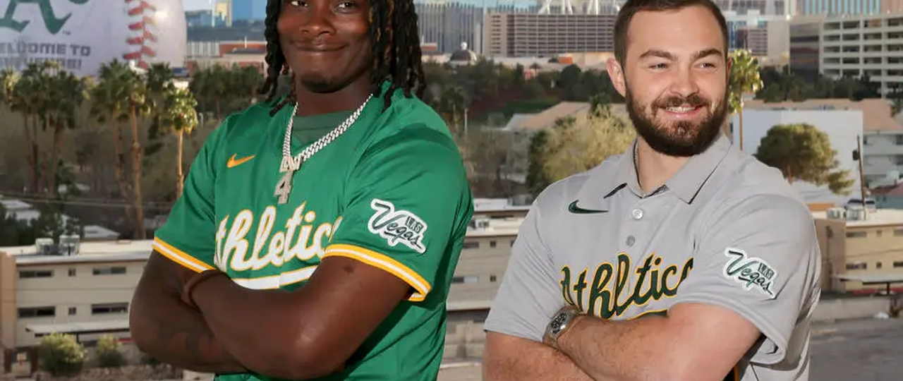
John Fisher is a snake who should not know peace any time he steps foot in the Bay Area. The A’s left Oakland for Las Vegas this offseason despite the fact that they do not have a major league stadium available for playing in Las Vegas. While they are currently playing their home games at Sutter Health Park in West Sacramento, they are officially just “The Athletics” with no location attached to the nickname until the Vegas move is completed or abandoned. The jersey sponsor is the Las Vegas Tourism Board, which is honestly kind of a stroke of evil genius? Even though the A’s don’t have an official location and are playing in Sacramento, every A’s jersey for the next three seasons will bear the words “Las Vegas” on them. I’d love it if I didn’t hate it.
Tier Seven: Just Slap It On, It Works Fine
22. Miami Marlins
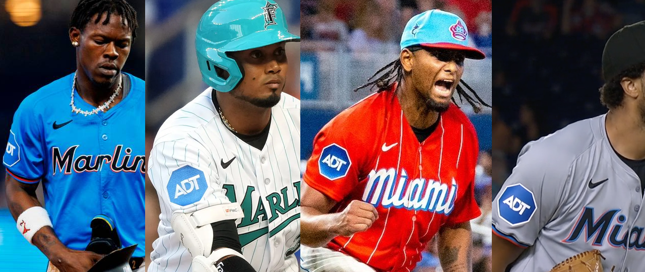
The ADT logo is almost a match for the light blue color the Marlins use but it isn’t quite right. They also do not change the logo in any way for the various jerseys, and yet because the color almost matches, it kind of works? The second-worst application is on the City Connect Jerseys, where the blue really contrasts with the red and doesn’t match the blue on the jersey or the hat. The worst application is on the Florida Marlins throwbacks, where the blue doesn’t match anything at all. Also putting a jersey sponsor patch on a throwback jersey should be a federal offense.
23. Texas Rangers
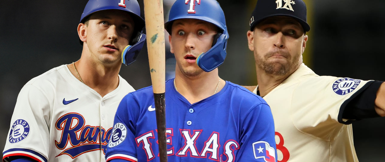
Somehow, I missed the fact that the Energy Transfer logo colors are flipped on the blue jerseys so this isn’t a true slap job. Still, it has all the same problems as the Marlins jersey above where the blue doesn’t quite match the Rangers blue, except it’s even worse-looking on the City Connects than the Marlins’ ADT patch.
24. Arizona Diamondbacks
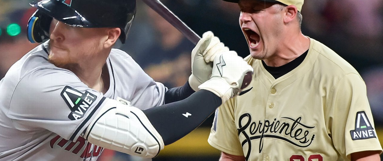
The original Diamondbacks AVNet was truly horrid, and this one is only a slight improvement. While it’s no longer an unsightly rectangle, it is still too big, and the mint color in the AVNet logo is not a match for the D-backs teal. If they shrunk it a bit and changed the mint to match the jersey (and changed the white to sand on the City Connect), it would probably sneak into Tier Three.
Tier Eight: Come On, You Didn’t Even Try
25. Kansas City Royals
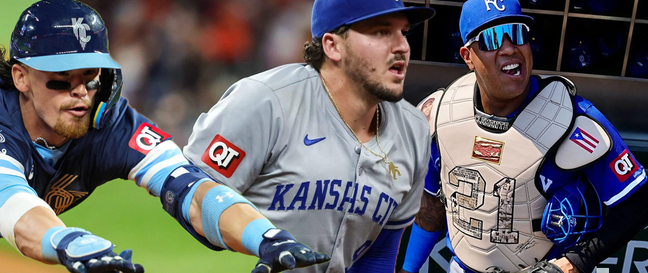
This tier is filled with the sponsors that just took their regular logo and slapped it on the jersey with no regard for fit or aesthetic. It’s kind of hard to separate the badness of these, but I did my best. The Royals and QuikTrip come out on top of this tier because despite the fact that red is not a Royals color, blue and red go together very well together as evidenced by 12 other teams using it as their primary color scheme. Also when I was a kid, my friends and I would hang out at our local QuikTrip all the time, so nostalgia points.
26. Baltimore Orioles
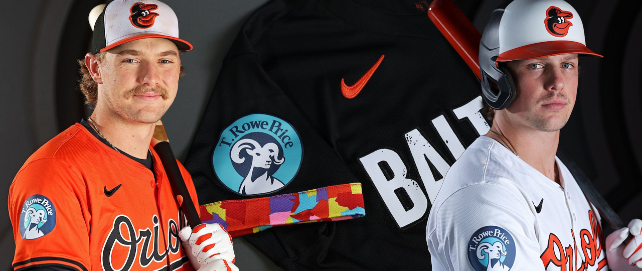
I don’t even know what this is. It just sucks.
27. Seattle Mariners
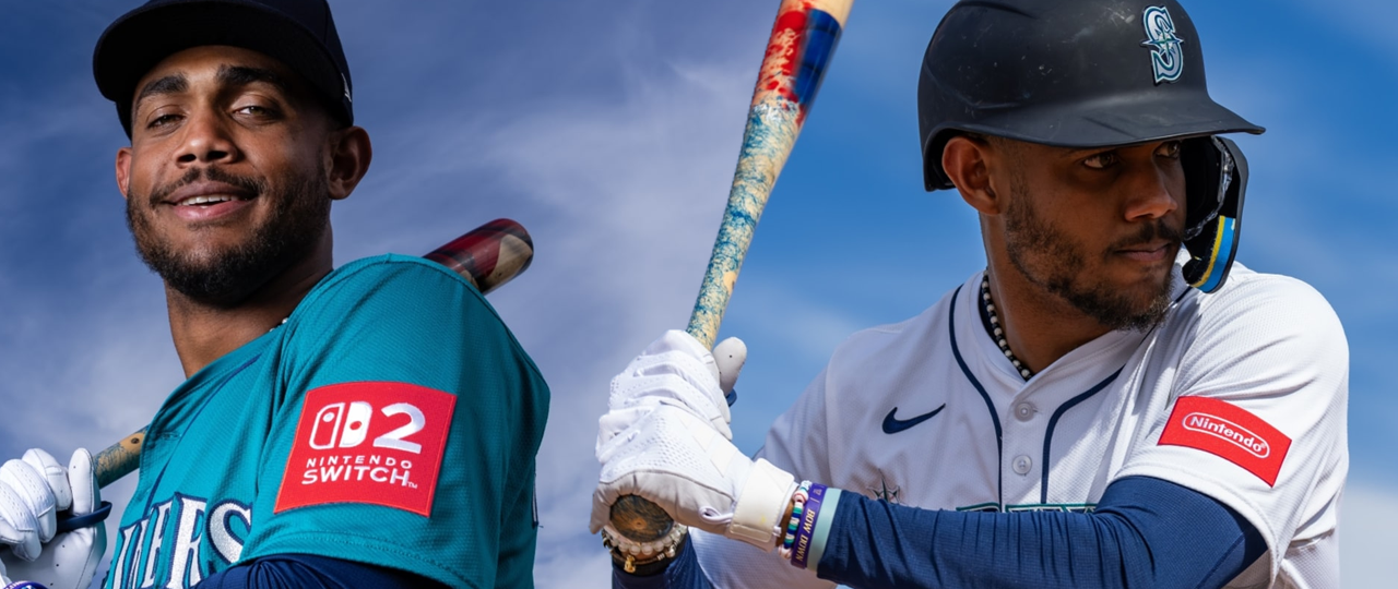
Oh boy. A Nintendo patch on a Mariners jersey should be a home run, but this application is tragic. The easiest fix is that the “Nintendo” patch on the home jersey should obviously just be the classic pill logo in navy instead of a bright red rectangle. The Nintendo Switch 2 patch is absolutely horrid though. A giant red square on the shoulder of a teal jersey with a massive ad for a specific product is the worst possible outcome for sleeve patches. And yet, there’s three that I think are worse.
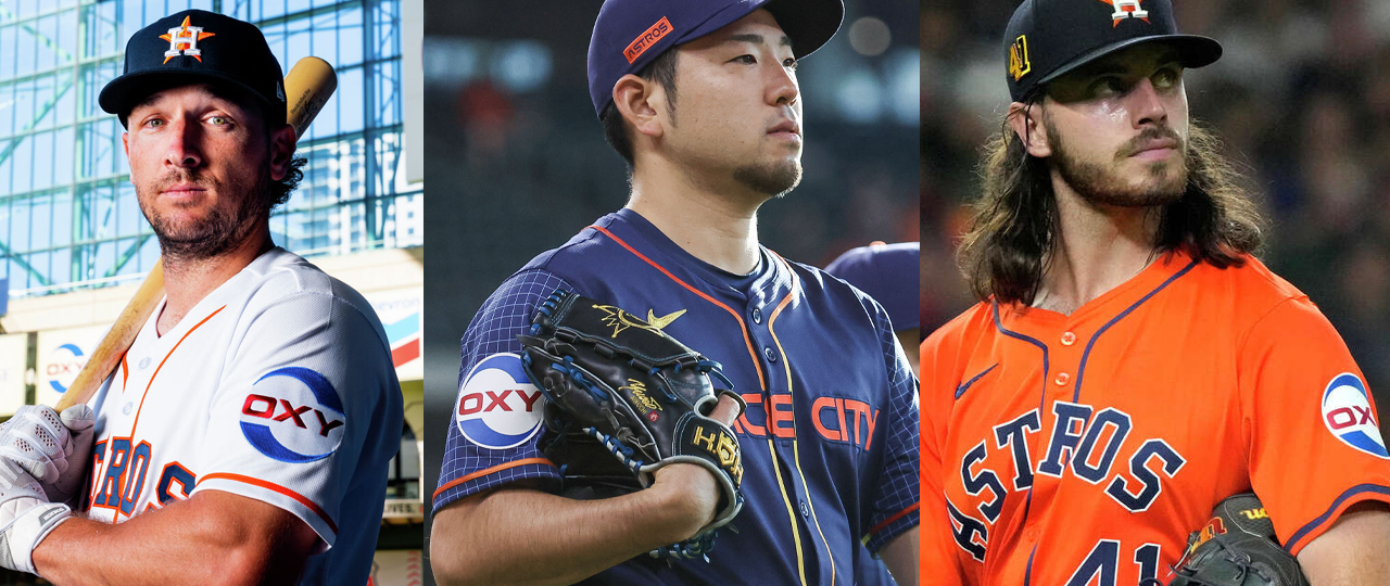
28. Houston Astros
I hate the big-ass Oxy logo. I don’t know what it is that puts it below T. Rowe Price. Maybe it’s because the red is just so close to the Astros orange and yet doesn’t quite get there. Maybe it’s just because it’s so huge. I dunno man, I just hate it.
29. Atlanta Braves
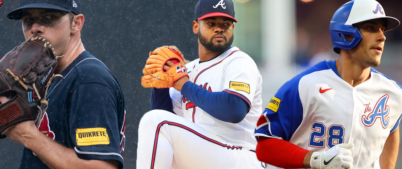
An awful mismatched logo for a dumbass company that’s slapped on an iconic jersey. God this sucks so much. And then the application on the City Connect where it’s almost on the damn shoulder? Fuck you Quickrete. Someone get Coca-Cola on the horn.
30. Toronto Blue Jays
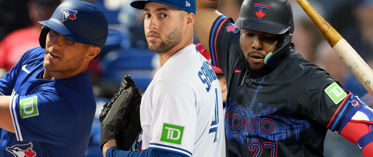
A bright green patch on a blue and white (and red) jersey? Why would this ever be a good idea? The Jays have a great uniform set and they deserve better than this.
For more of my baseball takes, check out Rain Delay Radio at http://raindelayradio.com
Leave a Reply